A couple of months ago my friend Jana helped organize HashiConf Europe, and asked me to work on generating custom artwork for each of their speakers. This was my first experience with creating art for someone else, and especially art that had to match someone else’s artistic guidelines. I’ve said this before, but I live and nap by the idea that rules (and editing) are at the core of the artistic process and not having to do that myself was brilliant. I wanted to write a bit about it because a) I did a bunch of work that I’m really proud of and I never got to talk about it and b) I am vain and I want to talk about it.
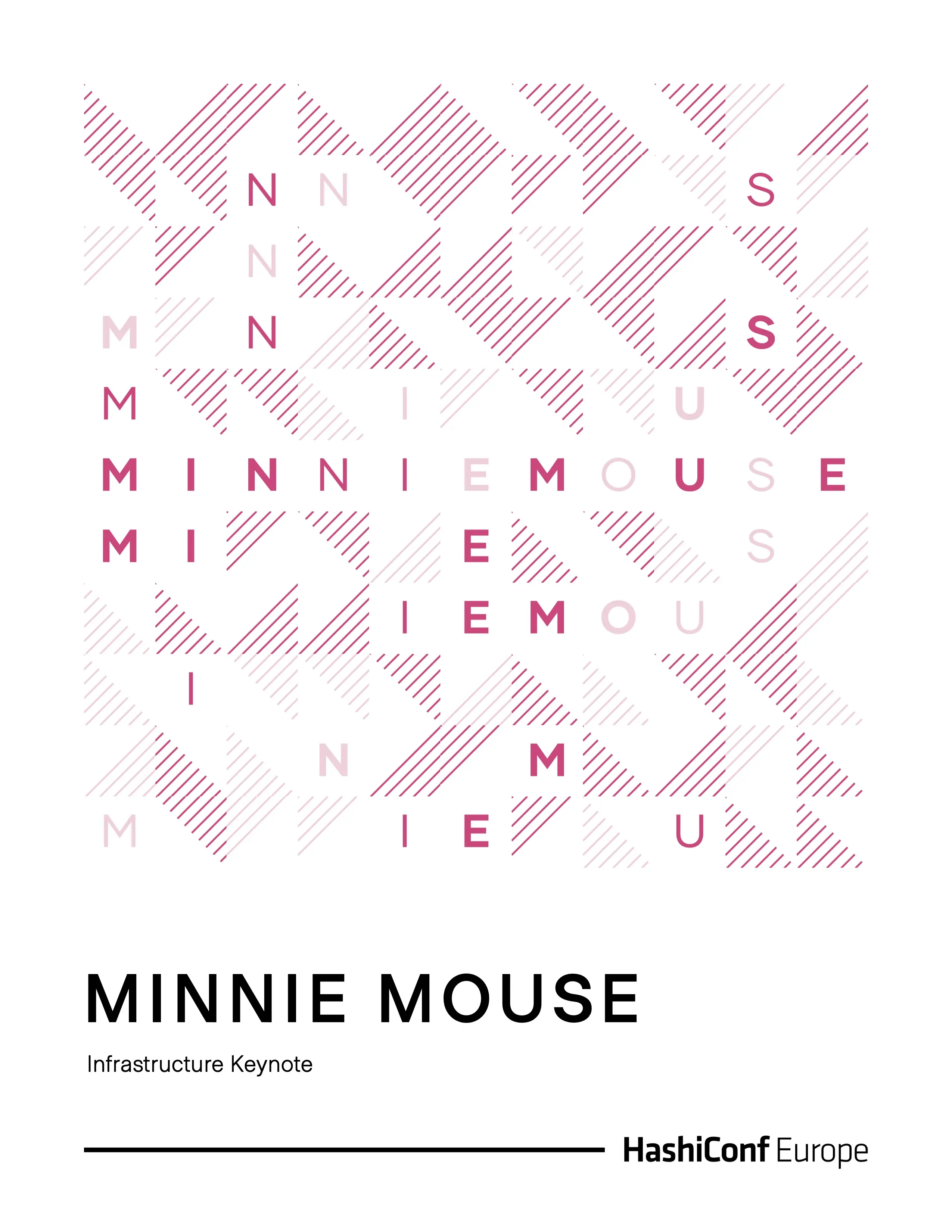
This was the final poster:
And this is what we wrote about it on the card that accompanied it:
Enclosed you will find an art print made for you by generative artist and engineer Monica Dinculescu.
This individual print is unique to you and you alone, as Monica has incorporated your name, the title of your talk, and the color of the HashiCorp product that you are talking about at this year’s conference.
Each cell in the grid has been randomly generated to contain either a letter from your name, or a pattern in the product color.
Cells located towards the middle of the grid are more likely to contain a letter rather than a pattern, and this likelihood decreases in the cells towards the edges.
This print is the only iteration of its kind. Were it to be generated again, it would look slightly different each time.
I print everything in my art store myself, because I sell very limited editions and third-party printing companies only make sense financially when you’re printing in the several dozen. This does mean that sometimes I’ll fight with my printer thinking that its colour profile is whack, only to discover that it was Doing Just Fine™️ and my MacBook oversaturates things like it’s an Instagram filter in 2011. Every day is a school day.
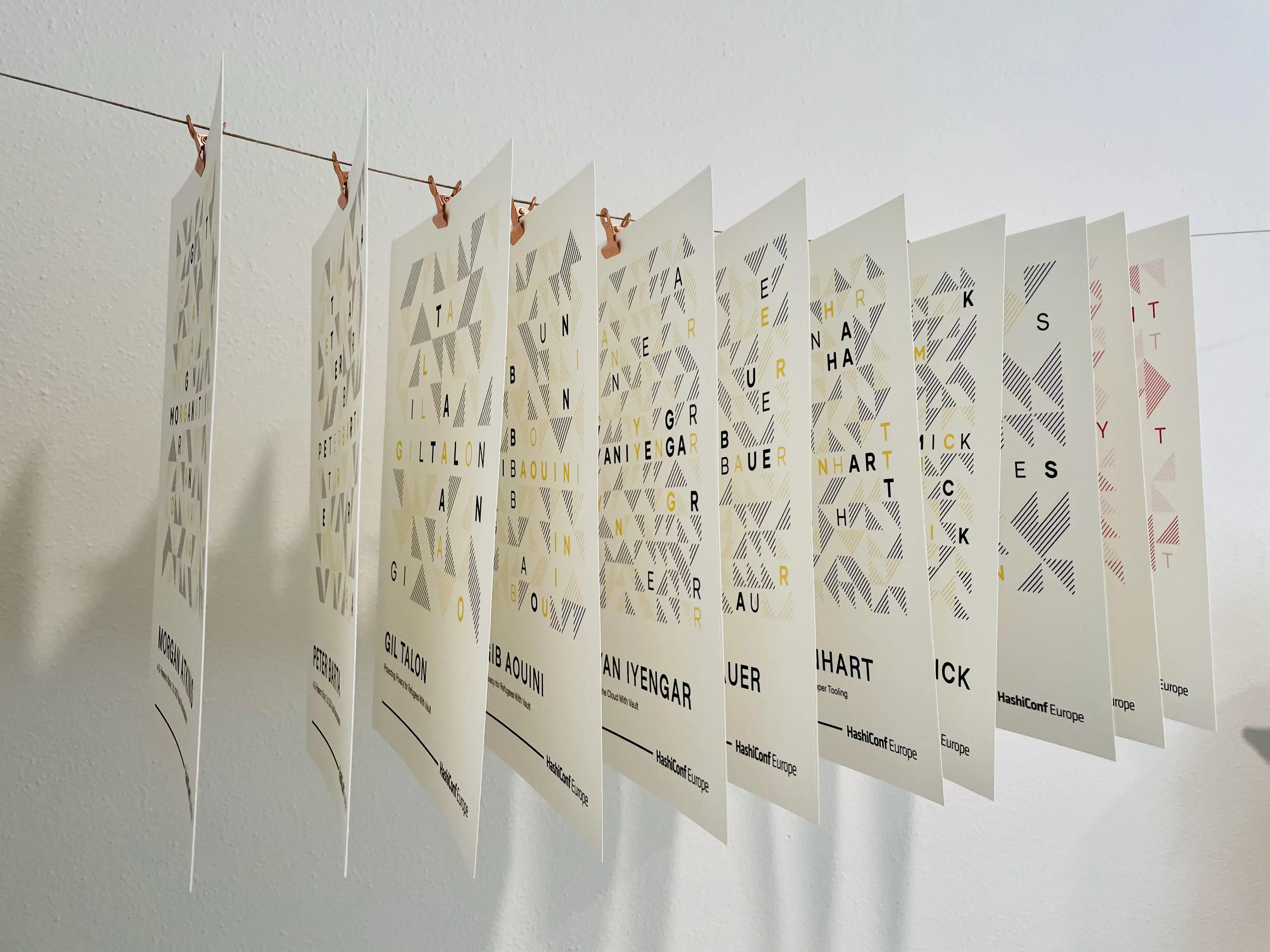
Here are all the prints drying on their totes profesh drying rack that is definitely not just a string I hung around in my office.
So, how did we get here?
v1: I have no idea what you want
The design team’s requirements were clear and wonderful:
- follow the conference guidelines: there is a set of product colours that can be used in very specific ways (either as a solid colour, a gradient, a grid of dots, hashed lines, and nothing else) and should be used to have a geometric grid feeling.
- the art should be unique and somewhat meaningful to the speaker. Like, random shapes might look beautiful, but they have no immediate connection to the speaker or what they were talking about, and needing to explain it too hard takes away from the magic of someone making you your very own art.
When I think of geometric posters, I (and everyone who’s ever looked at a design book) think of Bauhaus, and that’s exactly where I started. Here’s some iterations from this round:
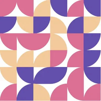
Too Partridge-Family: I started with a basic Bauhausy sort of grid, but we felt that it looked too much like a grid of birds. Not all was lost, though; you can see this in a different style on the home page now!
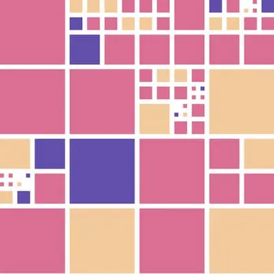
Extremely Mondrian-y, divided grid of squares. Really boring.
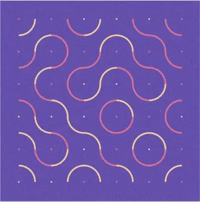
Random paths on a grid. These are called Truchet tiles, and they're a pretty classic generative art approach. I thought this looked really cool by itself, but it didn’t have a ton of connection with the speaker so we scraped them early on.
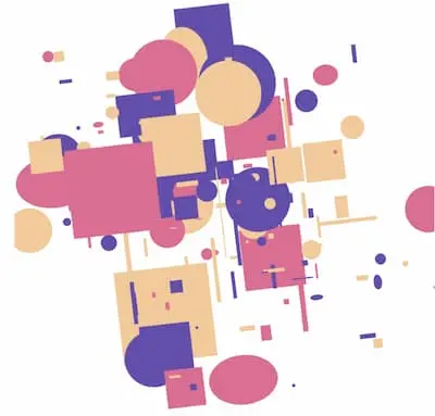
Random shapes in random places. Too generic, kinda boring.
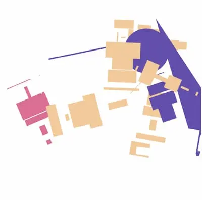
Random shapes in random places but channeling Suprematism. I LOVE this style and I would LOVE to use it again, and I very well might.
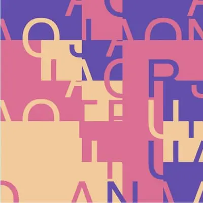
Grid of squares with some overlapped letters. This was one we liked because it had both a grid and the speaker's name, but it felt a bit too chaotic in this iteration. It honestly looks to me like I sneazed a bunch of letters on a grid.
At this point I also considered some data-based art, but I didn’t have enough interesting data that I could aggregate based on a name and an abstract alone. Anyway, did you notice how a lot of the iterations in this bunch are fairly standard generative-art approaches? Like, nothing here was novel, and I intended it that way: I wanted to figure out what the team had in mind, and the only way I knew how to do that was to use some common language we all knew, which is “things we’ve seen before”.
v2: Grids of letters
What came out from the previous explorations was that they liked the letter grid the most, but not as it was. At this point I also learnt that a specific colour (like, blue) is associated with a particular product (in blue’s case that product is Vagrant) that a speaker is giving a talk about. Each of these products have a primary and a slightly lighter secondary colour, which is why below you’ll see I stopped mixing different product colours together.
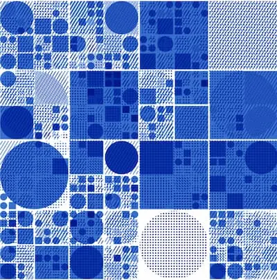
Can we do something with that Mondrian-y grid, but make it less boring with textures? Answer: yes but not in a good way.
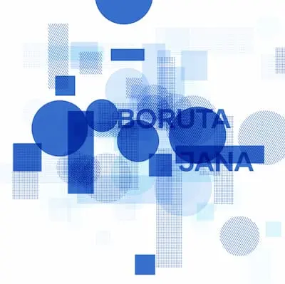
Can we do something with those random shapes in random places, but by also remembering the user has a name? Answer: no and let's never mention this horror again.
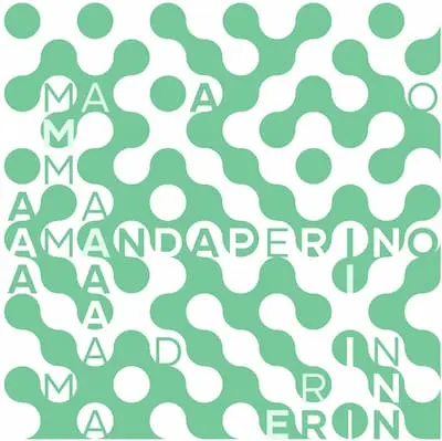
Enough of that; let's go back to our friend, the grid. Truchet tile blobs with letters. I vetoed this before even sending it over because it was serving very solid 70s lava lamp vibes. At this point I also went a bit mad looking at just Jana's name, so I branched out to another team member.
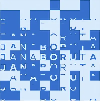
Grids of squares with letters. A bit boring, a bit "not a fan of cutting off letters on principle". This image is really good at showing the letter distribution algorithm that all the grids are using: it's mostly centered around the center horizontal line, and then spreads out randomly outwards and downwards from there.
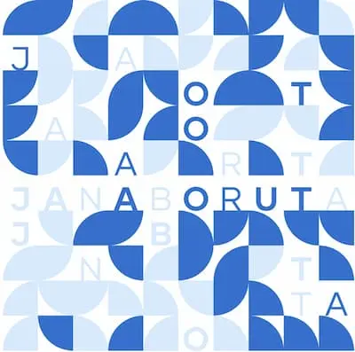
Grids of Bauhaus-style quarter circles or letters. I kind of like this, but overall it still felt a bit too basic and too “classic Bauhaus”.
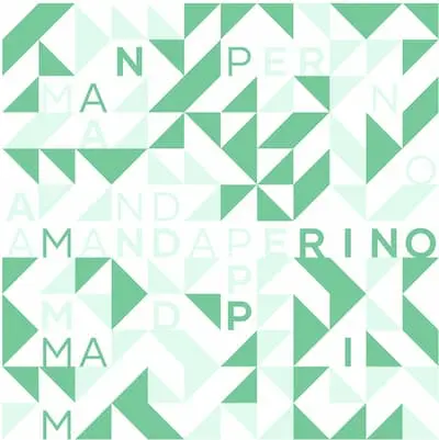
Grids of triangles or letters. This one looks kind of nice, doesn't it? We thought so too.
You’ll notice that all of these images are very similar looking. This was an extremely good sign for me because I knew we were on the right track, and in the cleaning up stage.
v3: Bring it home
We all loved the triangles the most, and in order to make them a bit 🌶 spicy, I decided to vary the texture of the triangle. Remember, I was allowed dots and hatches too! So in the final version, each triangle can be one of the 2 colours belonging to the product, either hashed or filled. Bish, bash, bosh.
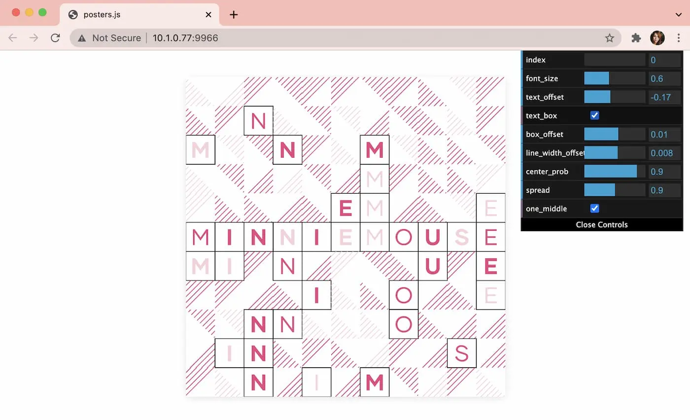
From here it was just a matter of designing the poster layout around it, and making sure I had a plan for when my random number pixel math wasn’t quuuuuuuite good enough. Thankfully, dat.gui exists, and this is what I looked at while generating 50-ish posters:
Would I do this again?
Absolutely. I honestly loved every step of this. I worked with 3 amazing women from start to finish that had good instincts and were kind and supportive af. I got to think outside of a box I wouldn’t have normally found myself in. I tend to obsessively listen to a new album for 100 hours and I exclusively listened to Jessie Ware for this project (and then, ironically, never again).
Most importantly, I made something that is in 46 humans’ hands. I hope they liked it!!!
I would love to do this again, so if you’re a conference or a company that thinks this was a cool idea and want to do this for your speakers or employees, send me an email ! I’ve got way more ideas where this came from and nothing to do with them.